PHOTOGRAMMETRIC ENGINEERING & REMOTE SENSING
May 2015
351
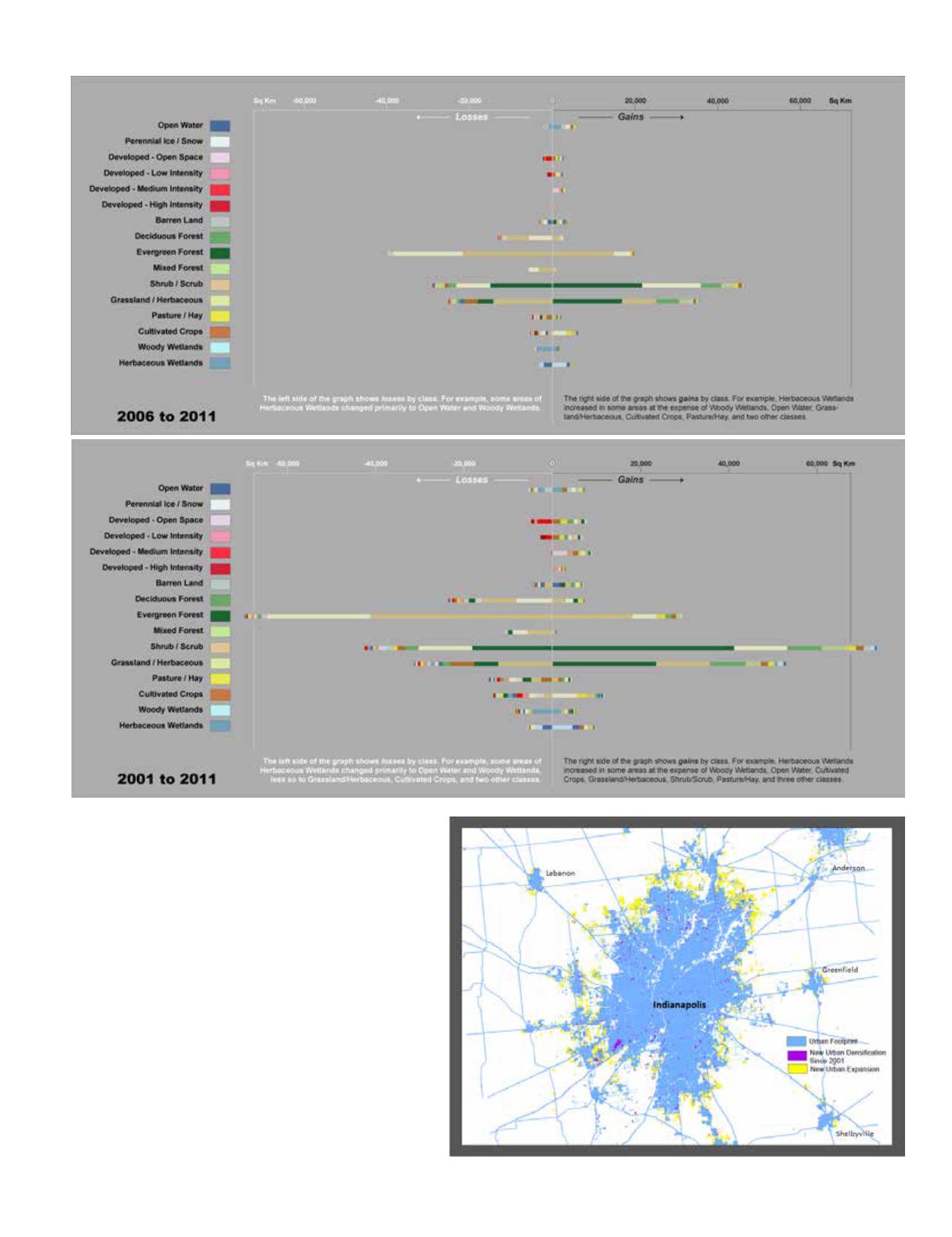
Figure 1 (above). Source and magnitude of land cover class
gain and loss for each NLCD land cover class for 2006–2011
and 2001–2011. The length of the bars represents the percent
change relative to the total change area with the equivalent area
in square kilometers annotated at the end of each bar. Proportions
of each bar are colored by the proportional contribution from each
land cover class to the total loss or gain. The left side of the chart
(white numbers) represents class loss magnitudes and presents
which classes a class loss was converted “to” in 2006 or 2011,
while the right side of the chart (black numbers) represents class
gain magnitudes and presents which classes a class gain was
converted “from” in 2001 or 2006.
Figure 2 (right). Growth of urban impervious surface for
Indianapolis, Indiana, between 2001 and 2011 from the National
Land Cover Database. Blue represents the total urban footprint
for the city, purple areas show where urban impervious surface
increased in density over 10 years, and yellow areas represent
expansion of the urban impervious extent into previously nonurban
areas over 10 years.


